Throughout 2019 my intention is to visit a Tate gallery once a month. At nearly 100 miles to either Tate Modern or Tate Britain & further still to Liverpool or St Ives this is a hefty commitment, but having taken annual membership it feels a responsibility I want to make count.
Tate Modern – 03 January 2019
Anni Albers Retrospective 11 Oct 2018 – 27 Jan 2019
I arrived at Tate Modern on a chilly January morning, keen to meet 4 fellow students who’d agreed to meet up for the exhibition. When I’d organised the visit I hadn’t any specific outcomes in mind, I knew nothing of Anni Albers and next to nothing of woven textiles. Imagine then my amazement on leaving the exhibition feeling as if I’d just been through a pivotal experience!
Id loved to have met Albers. She appears to have been a fearless innovator, on the surface following tradition, but although working within physical constructs bending the accepted boundaries and venturing further in to the unknown with every passing decade. Curated by Ann Coxon and Briony Fer, Room 1 of the exhibition seemed to make one simple statement, “I am Anni Albers, I am a weaver”. On a central dais stood a smallish loom, behind that a large wall hanging. On first appearances, to the untrained eye at least, the hanging seemed simple, rational & in all likeliness quite functional. I didn’t realise then these were some of the key ideals held by the Bauhaus, the famous German art school in operation from 1919 to 1933 and at which both Anni and her husband Josef Albers taught.
The subsequent 10 rooms were anything but simple. Packed full of work I gradually began to categorise what I was seeing as Pattern, Pictorial and Textual weaving’s. I’m currently studying abstract art from both a random and rational perspective and although I understood the theory it really began to make actual physical sense as I looked on clear examples in this exhibition. Albers abstractions in her earlier Pattern work, such as Wallhanging 1926, seemed surprisingly random, there were no given contexts, no clues, titles or identifiable known comparatives for me to establish a connection to the piece. I wondered whether I’d got this wrong considering the method of making, the restrictive nature of a repetitive weave process producing a geometric & predictable result, however the lack of repetitive coloured blocks in the pattern supports my conclusion, not one square of the same colour was repeated in a predictable or repetitive place within the work.
Albers turned toward Pictorial weaving’s creating abstract variations based on her own experiences, and yet these had even less predictive colour pattern. Logic tells me these are more random in nature yet in her piece South of the Border 1958 it is undeniably rational. I connected immediately with the bright colours of a Mexican landscape and though not a formed realistic landscape I had no doubt in my mind that’s what she was showing me. The title itself was a good clue, the bright oranges, reds, yellows and blues typical of that culture even in today’s associations but I knew and understood that even before I’d read the title or learnt of the many trips to Mexico she & Josef had made.
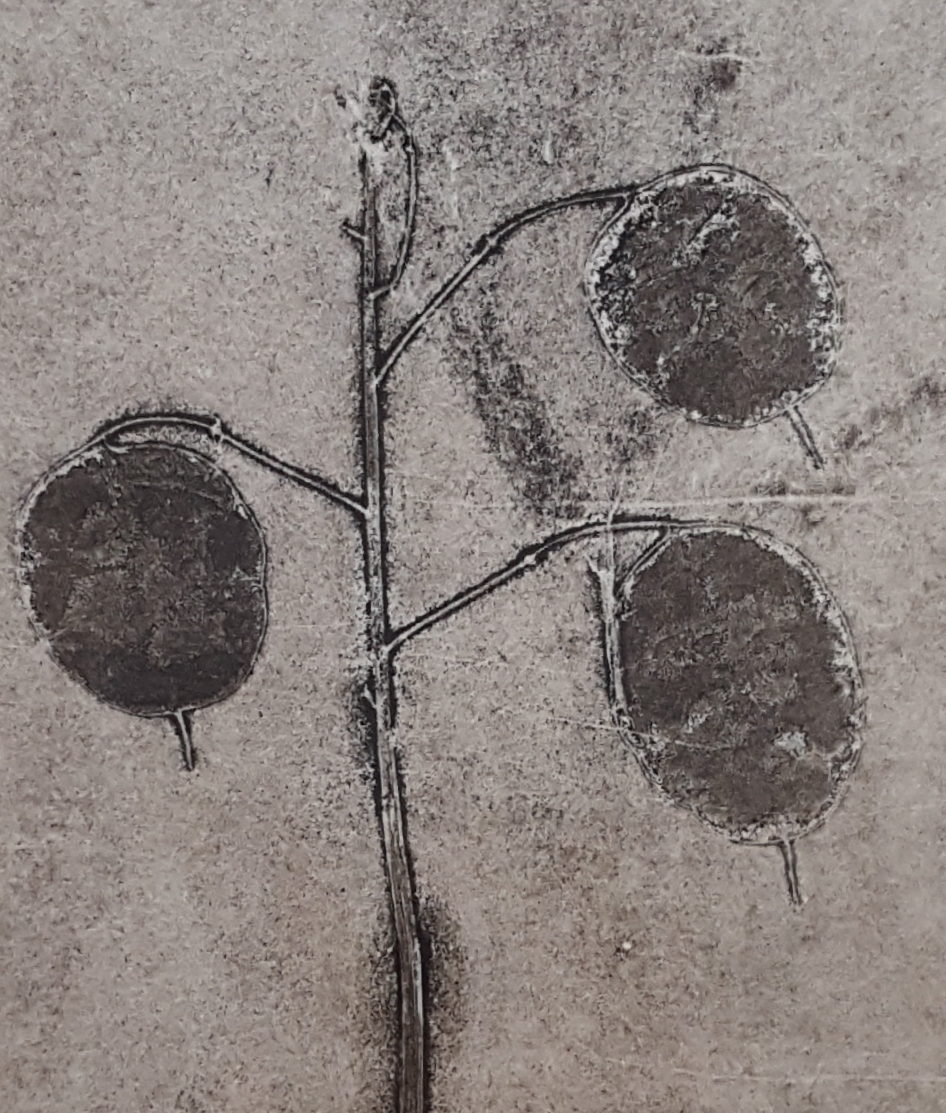
Turning toward the Textual weaving’s, the sense of a communicative language was overwhelming and I include her knot drawings & weaving’s here too. I didn’t need any clues to help me understand, I could almost hear them, of Anni chatting away to me through them. Her explorations of pictographic and textual research really made sense, text and textiles sharing a close similarity on multiple levels and the familiarity of a written language all combining to induce an innate dialogue between myself and the artist. A lovely example of this is Code 1962 reminiscent of Morse Code, a music score or even Egyptian hieroglyphs amongst other comparatives.
I take away from this exhibition a much deeper understanding of the importance of recognising what I want to impart through my work and to consider this in my initial investigations and it opened up ideas for alternate perspectives & techniques. As I move on to Part 2 Assignment, Anni’s work will undoubtedly be in the forefront of my mind. To be clear about the origins of my work, make a distinction about what outcomes I’m aiming for, working toward a random or rational abstract piece of work from the outset. Extended research & sketch book work exploring experimental investigations whilst simultaneously keeping these ideals in mind will go a long way toward helping me achieve a successful abstracted outcome.
There was a staggering amount to take in during the 2 hours we spent at the exhibition, it is unquestionably worthy of much further consideration. I haven’t mentioned the spellbinding embossed work, array of geometric shapes or inordinate selection of materials used to weave her masterpieces, her books or masterful skill to mesmerize and enchant the onlooker. A truly fascinating experience.
Tate Britain (plus White Cube Gallery) – 09 February 2019
Don McCullin Retrospective 05 February – 06 May 2019 – Tate Britain
Edward Burne-Jones 24 October 2018 – 24 February 2019 – Tate Britain
Tracey Emin A Fortnight of Tears 06 February 2019 – 07 April 2019 – White Cube Bermondsey
 I’d been eagerly looking forward to Don McCullin’s retrospective since Id first learnt of it and I wasn’t disappointment. I smiled, I lost myself in the images & several times I struggled to hold back the tears, hearing many people in the room sniffing surreptitiously too. Photographs of starving people, mothers holding pot bellied children during the Ethiopian and Somalian famines & the Democratic Republic of Congo war, all bought back unsettling memories & emotions for me. As I stumbled slowly in the queue past each black & white photograph I was transported to a time when I read physical newspapers & their supplements and saw these photographs, when war & famine felt were very real and frightening even though it was many miles away & I was a child safe at home. I don’t remember the homeless from a time when McCullin was mostly taking photographs of them in Spitalfields & other areas of London back in the 60’s, 70’s & 80’s , but I see them regularly today and sadly not much seems to have changed in this country. At the end of the exhibition were some very atmospheric images of Somerset, McCullin’s home county and his love for the area is apparent to see. Technically I know nothing about photography but I see fabulous use of Chiaroscuro or the opposite in some photos of an almost a smudging effect happening, all used to create atmosphere and dramatic effect.
 The work of Edward Burne-Jones (1833 – 1898) was a complete contrast. I’d been ambivalent about seeing it but we had spare time and I can truly say now that I’m very pleased I did. The scale alone of Burne-Jones work was staggering & the range of experimentation quite surprising. I enjoyed seeing work using gouache, metal leaf & thread & oil pastel to name just a few, the subject matter had clear influence of the Pre-Raphaelite artist Rossetti, even down to the models in his paintings looking very much like Elizabeth Siddal, but I hadnt expected to see images of mermaids or pencil studies looking almost contemporary in style and half-finished work that clearly showed he was experimenting in both style & technique. I think I shouldn’t have been surprised but work such as Burne-Jones often comes across as polished and somewhat distant to me. The work in this exhibition was eye-smackingly intrusive, full of narrative & personality and I loved it!
 A dash then to the White Cube in Bermondsey and Tracey Emin’s new collection of multidisciplinary work in her exhibition A Fortnight of Tears, of large scale sculptures, neon lighting, photography, film, print & painting. I hadnt read the show synopsis before walking through each room but I didn’t need to. It was sad & troubling and I came away feeling very unsettled indeed. I later learnt its focus was primarily death, her Mother having recently passed away & the work was her response to this event. Emin is controversial indeed but if art is made to stir the soul, touch the senses and make us ask questions, then this exhibition hits it bang on for me.
Tate visit in March 2019 was a study visit to see the Pierre Bonnard exhibition, see Workshops & Study Visits here for the write up.
Tate Modern (plus RA & National Gallery) – 27 April 2019
The London Original Print Fair 25-28 April 2019 – The Royal Academy of Art
SOROLLA Spanish Master of Light 18 March – 07 July 2019 – National Gallery
Sean Scully – Sea Star 13 April – 11 August 2019 – National Gallery
Dorothea Tanning 27 February – 09 June – Tate Modern
 Another chilly day in London, but so very worth it. I met up with fellow student & regular partner in crime Michael Whyte, initially to check out The London Original Print Fair, a trade fair open to the public which the RA put on every year but also to take in the Dorothea Tanning exhibition.
Id been to the Print Fair in 2016 & remembered the value of my visit. This is an event that has work from masters through to unknown or up and coming new artists, most of which is marked with a sale price.  As I wondered through the partitioned stands looking at the prints bought in by the galleries, I was delighted to see some key pieces by Grayson Perry. I hadn’t seen any of these in the flesh & have determined to see as many of his printed works as possible so this was a great stroke of luck. I also saw work by Kate McCrickard for the first time, represented by Julian Page her work is described as offset drawing with monotype, marked up in the region of between £1,000 & £2,000 each.
Other key artists of the Print Fair for me included Keith Vaughan, Paul Rego, William Kentridge, Mychael Barratt, Ralph Steadman, Marc Chagall, Henry Moore, Anita Klein, Ross Loveday, Nic Fiddian-Green, Barbara Hepworth, Eileen Cooper, Graham Sutherland, Laura Boswell, Margaret Ashman & Kristiane Semar. All of who’s work was priced between £1,000 & £25,000. Photos I took on the day can be seen on this Pinterest board.
Then a walk to the National Gallery for a quick peak at the Sorolla Exhibition, which frankly totally blew me away. I recently saw the Pierre Bonnard exhibition, whose work I hold in very low regards. The tutor on the day tried to convince me Bonnard is a master at colour & light, but I didn’t agree. Now, Sorolla, he’s a true master of colour & light & leaves Bonnard shaking in his wake! Sadly we only spent about 10 mins in the exhibition as we’d gone to look at a specific painting in the permanent collection plus a look at Sean Scully exhibition Sea Star so time to move. I didn’t think much of Scully’s work, reminiscent of Rothko in an abstract expressionist manner, it seemed to me to be blocks of colour and nothing more. I did enjoy the translucent effect with other colours from beneath the top layers shining through but felt nothing when I looked at them.
Finally on to the Dorothea Tanning exhibition at Tate Modern & what a wonderful surprise. When I consider surrealism I think of Salvador Dali, with realistic but fantastical scenes. I think in total there were only 2 or 3 of this style & the rest of the exhibition showed how many varying approaches she actually had. It was a clever exhibition in its layout too. Normally you enter and leave an exhibition through different doors, but for this one it was the same door. When we got to the last room a video was playing on continual loop and we sat & watched it through, about 10 or 15 minutes worth of film. It showed Dorothea talking about her work, providing insight, reasoning & the playful, experimental side of the artist. Once we’d seen the film we made our way back through all 8 rooms but this time as I scanned the work on my way out I was seeing the paintings differently, with fresh eyes and more understanding. I enjoyed her play on colour in her prismatic stage in the mid-1950’s, although the image might be disturbing & thought provoking, the play of colour & light was delight.
Tate Modern – 13 July 2019
TAKIS the 03 Jul – 27 Oct 2019
Natalia Goncharova 06 Jun – 08 Sept 2019
Olafur Eliasson 11 Jul 2019 – 05 Jan 2020
I hadnt known what to expect from the Takis (born Panagiotis Vassilakis) but found I was spell bound by his 3-dimensional works of art exploring magnetism, light & sound. Born in Greece in 1925, work by Takis is now very popular in France & Wikipedia states he is renown for his artistic investigation of the gap between art and science.

There’s something quite magical about the pull of a magnet, I loved playing with magnets as a child & that simplistic fascination has it seems stayed with me! To see spanners defying gravity with such strength as to almost tear away their grounding wires was frankly amazing and I could have starred for several hours at each piece of work.
The extensive exploration of materials is clearly abundant in this exhibition, not only magnetism but light & sound too which was something else I’d not before experienced.
Sound and Silence, seen in the clip below, is a sculpture producing unpredictable sound in response to air currents which becomes uncontrollable & takes on a life of its own. I’m attracted to this method of making art, its visual, its interactive & reaches more than one of our human senses sense.
We moved on to see the work of Natalia Goncharova (1881-1962), a Russian avant-garde and female artist who produced work on the opposite spectrum to Takis. Its interesting to note here that I found it even harder to engage with Goncharova after we’d come straight from the work of Takis than I think I would have otherwise. Goncharova’s work stretches across many platforms, from painter, costume designer, writer, illustrator and set designer. Moving to Paris in 1921 where she remained for the rest of her life placed amongst some of the times most influential artists & I think this showed in the work of this exhibition. Her styles were multifaceted and complex and although I didn’t feel much emotion on the whole when I looked at her paintings, there was one life-study which did catch my eye. 
A Model (Against a Blue Background) 1909-10 Oil Paint on Canvas, (shown here on the left) jumped across the room and demanded a much longer & closer look from me than any of her other work. Not only was this painting revolutionary at the time, its also spellbinding to say the least. Less imposing in photographic form, the painting itself must have been 80cm x 60cm & really is very commanding.
Finally we had time for some of Olafur Eliasson’s work in his interactive exhibition In Real Life. Eliasson’s installations never fail to leave a lasting impression and this one is no different. This was a large exhibition with a few queues so although we didn’t wait to experience all of the installations we did get to experience his light walk, otherwise known as Din blinde passager (Your blind passenger) a 39 meter long corridor filled with fog & light in which you can only see about 1.5meters ahead of you. The video clip I found online doesn’t show how when I blinked the world turned instantly black for a fraction of a second until the blink was over & my eye reopened! A surreal feeling indeed.
